Every few years, it happens. Everyone starts running around with their phone trying to catch invisible fantasy creatures. Entire communities dump buckets of ice water on themselves and capture it on video. All your friends dance to an old rap recorded by eccentric Canadian documentary maker Louis Theroux.
Trends — what an odd phenomenon.
In web design, we also have trends. Loads of them. There were times where everything was skeuomorphic. Years where we were whitespaced out of our damn minds. And right now, every third illustration you see is as flat as my stomach once was.
Some designers won’t touch a trend with a ten-foot pole, but I’m not sure that’s the way to go. As with everything, there’s a time and a place for trends. Following trends to quickly bang out designs because you’re not feeling ‘it’ today and deadlines loom over you like something from a scary movie, ain’t the way to go.
But when is it okay to use a trend in your web design?
Let’s first take a look at what a trend is.
What is a web design trend?
A trend, in the general sense of the word, is a shift in people's patterns. They can be observed in nearly every aspect of life: fashion, technology, art, entertainment. Even sports aren’t immune; or are you going to tell me you haven’t played pickleball yet? Exactly, trends are everywhere.
Thanks to trends, we skip breakfast because we collectively think that three meals a day is too much. We suddenly wake up at five in the morning because waking up just before work is so not done. These shifts in the patterns of our lives can last a long time or be over in a week. A very short trend we call a fad, while very long-lasting trends eventually become outdated.
Although it sometimes feels like you must follow all trends to keep up, it’s today’s trend breakers who are tomorrow’s trendsetters. Following a trend is always a choice, and sometimes it’s good to move with the crowd, while at other times, it feels better to push against it.
How and when you make that choice is always tricky, as important decisions usually are. So, let’s list some web design trends of 2023, so we can together see where we might (perhaps) push back.
Web design trends to follow in 2023
Nostalgia and Y2K web design
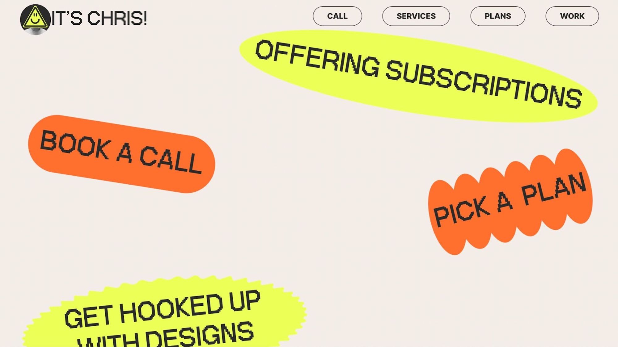
It used to be normal for trends to return every 30 to 40 years. That was when in a time when world turned slower than it does today. Although by that old logic we should be utilizing the color palette from the '80s, this year it's already trendy to follow the Y2K aesthetics from the early 2000s — 20 years ago.
This trend revolves around mono-spaced typefaces, pixelated artwork, and a strong focus on text.
The world turns so fast that trends accelerate, and that’s precisely why we reach back to designs from a time that felt simpler, even just a few short years ago.
Three-dimensional illustrations
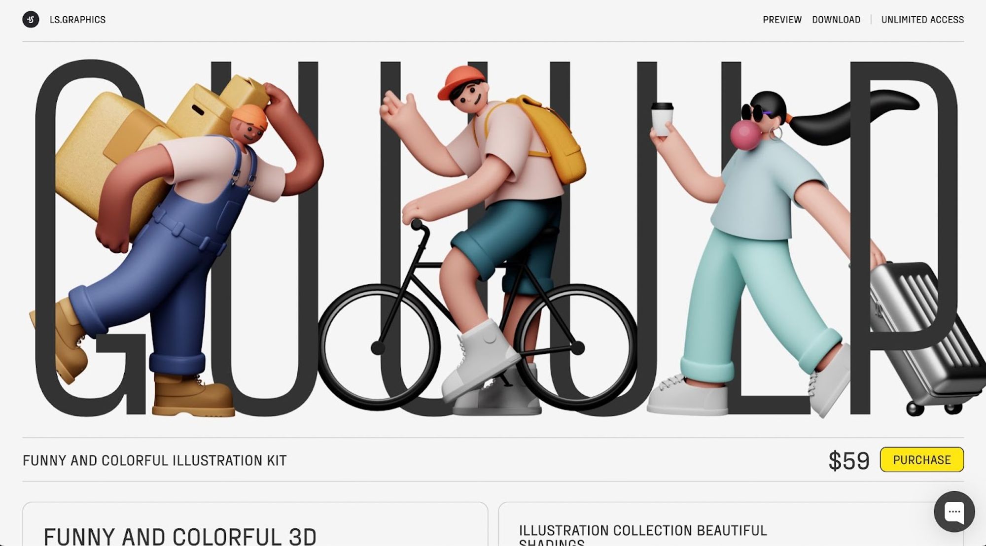
On the other end of the spectrum, we find the 3D trend, which leverages all the possibilities the web offers. This isn’t just about adding 3D illustrations, but about building entire 3D worlds in-browser as well. Now that everyone has fast internet, we want to move beyond the flat screen - experiences are gaining depth.
With the addition of the third dimension, possibilities become endless, but be careful to keep it simple. Your website must remain easily usable.
Interactive and micro animations
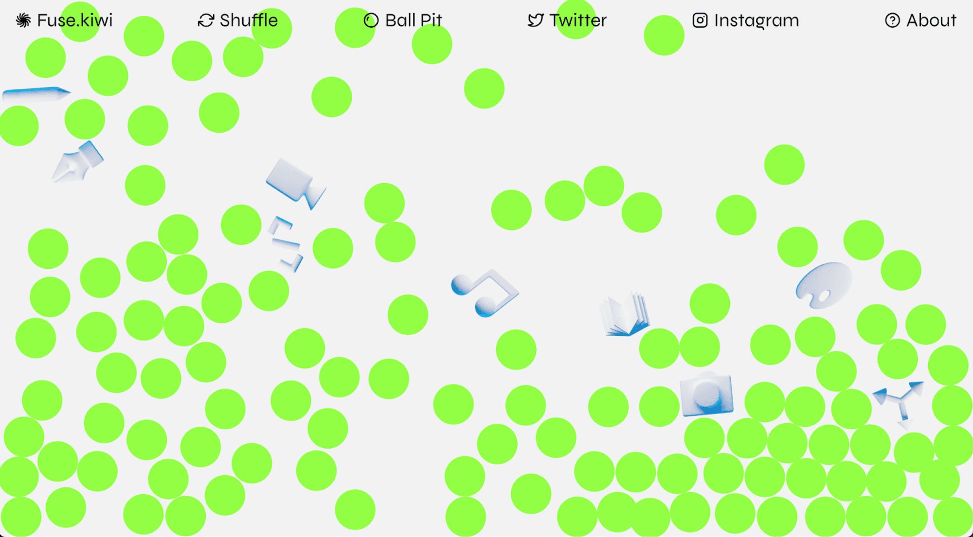
Just as the world around us reacts to our presence, so should apps and websites become more interactive. Technology is an indispensable part of our lives, so let’s make it as natural as possible — no static pages, but experiences that feel alive.
Customization
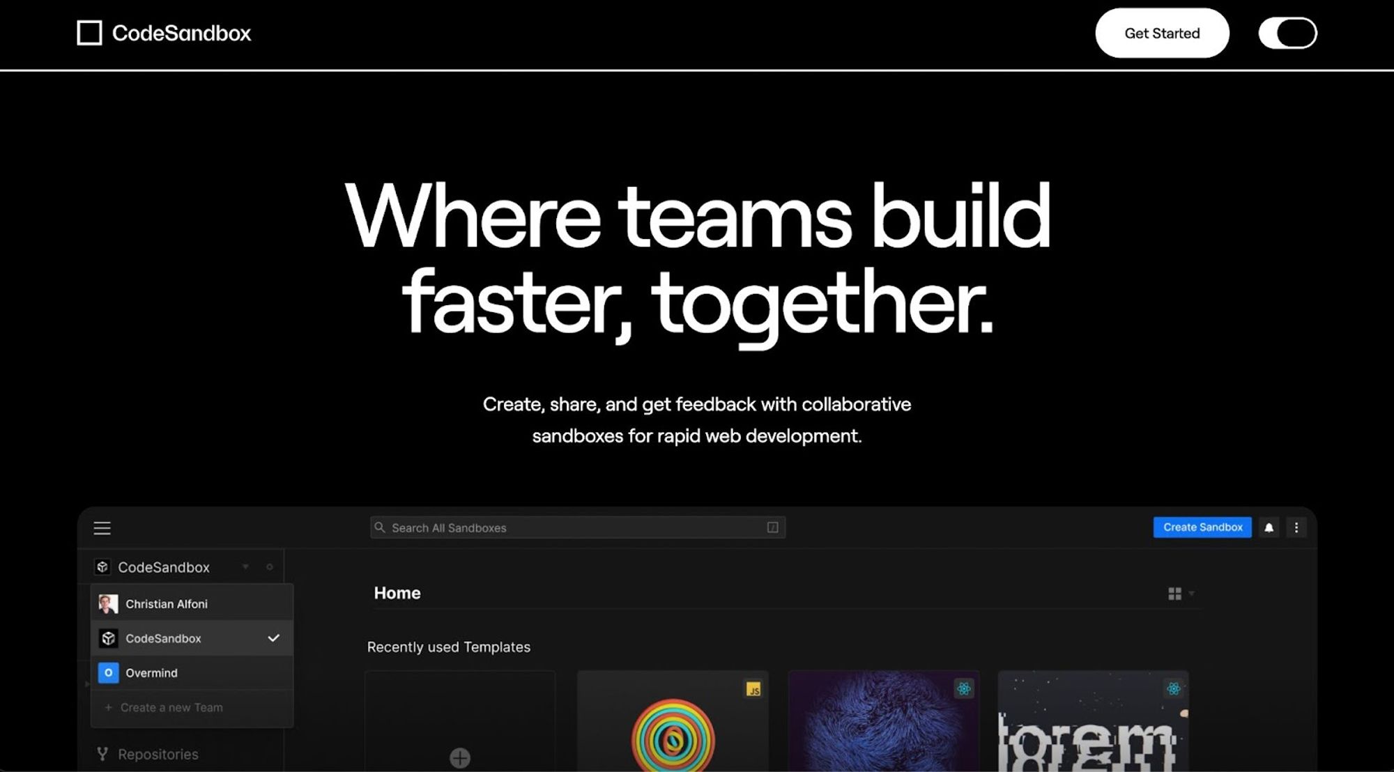
Let users tailor your app or website to their liking. By allowing someone to choose, for example, whether your website is light or dark, you give them control, thereby increasing their engagement with your brand. The beauty of this trend is that it increasingly centers everything around the user: what provides them the best experience? If they can tailor your website to their liking, they get the experience they truly want.
Give them control over colors, typefaces, and whatever you can think of.
Web design trends to avoid
As a designer, it's crucial to be on top of the latest trends. Your clients come to you for your expertise, and that includes knowledge of your field. However, they also come to you for your creativity, and that goes beyond blindly following the latest trends.
So, how do you choose?
Let's make it simple by stating there are two reasons to avoid trends: you want to develop your own style, or it suits your client to color outside the lines.
Swimming against the stream of trendy design while working for a brand that needs to fit into the contemporary zeitgeist, just makes you needlessly contrarian. You’re fighting for the sake of fighting and not serving your client’s needs. Suppose you work for a young fashion brand; it’s actually good to look to trends for design inspiration. This way, you find resonance with the target audience by creating imagery that fits their world.
So, breaking with trends should be a conscious choice. Let’s see what to consider when you do.
Choose your own taste. If you break with trends, do it to follow your own personality and let yourself speak through your designs.
Be consistent. If you decide to ignore certain trends, make sure to do so consistently.
Be critical. Why do you want to break with a trend? Is it your own ego as a designer or is it genuinely the best choice for the client?
Do research. Designing without trends is a significant challenge, so make sure you continue researching all design forms. This keeps you inspired for innovative ideas.
Ignoring trends gives you the chance to create a unique style, but professionally and creatively handling a design hype also shows that you're versatile.
What will you choose: to follow or avoid?
Dutch parents often ask their kids: ‘If everyone jumped off a bridge, would you do too?” We can pose that same question to web designers and, actually, everyone. People are a trend-sensitive bunch and often like to follow the crowd.
Whether you choose to follow or avoid trends should, in my opinion, depend on the client you're working for. They pay you for your creativity, but also to create the best solution for them. Sometimes this will mean following a trend because it fits the brand you're designing for.
The most important thing, therefore, is to be aware of your own process. If you always immediately reach for the latest trends, maybe it's time to challenge yourself with a blank canvas. Yet, always breaking with trends isn't the solution either.
As always, the truth lies somewhere in the middle, which direction will you go?

